Configuration Object
LiveCodes is very flexible and provides a wide range of configuration options. A JavaScript object is used for configuration and keeping state.
Usage
The configuration object can be used while initializing a new playground using the SDK.
import { createPlayground } from 'livecodes';

(async () => {
  const playground = await createPlayground('#container', {
    config: {
      // config options here
    },
  });

  // the object can be retrieved using the method `getConfig`
  console.log(await playground.getConfig());

  // and can be later changed using the method `setConfig`
  await playground.setConfig({
    // new config options
  });
})();
Alternatively, the URL query parameter config can provide a URL to a JSON representation of the configuration object to be used while initializing the app.
Example:
https://livecodes.io/?config=https://my-custom-server.com/config.json
TypeScript Types
TypeScript types are documented here and can be imported from the library.
import type { Config } from 'livecodes';
Default Config
Default config is defined here.
Project Content
These are properties that define the content of the current project.
title
Type: string
Default: "Untitled Project"
Project title. This is used as result page title and title meta tag. Also used in project search. This can be set in the UI from the title input (above result page) or from Project menu → Project Info.
description
Type: string
Default: ""
Project description. Used in project search and result page description meta tag. This can be set in the UI from Project menu → Project Info.
head
Type: string
Default: '<meta charset="UTF-8" />\n<meta name="viewport" content="width=device-width, initial-scale=1.0" />'
Content added to the result page <head> element. This can be set in the UI from Project menu → Project Info.
htmlAttrs
Type: string | Record<string, string>
Default: 'lang="en" class=""'
Attributes added to the result page <html> element. It can be an object or a string.
Example: { lang: "en", class: "dark" } or 'lang="en" class="dark"',
become <html lang="en" class="dark">.
This can be set in the UI from Project menu → Project Info.
tags
Type: string[]
Default: []
Project tags. Used in project filter and search. This can be set in the UI from Project menu → Project Info.
activeEditor
Type: "markup" | "style" | "script" | undefined
Default: Last used editor for user, otherwise "markup"
Selects the active editor to show.
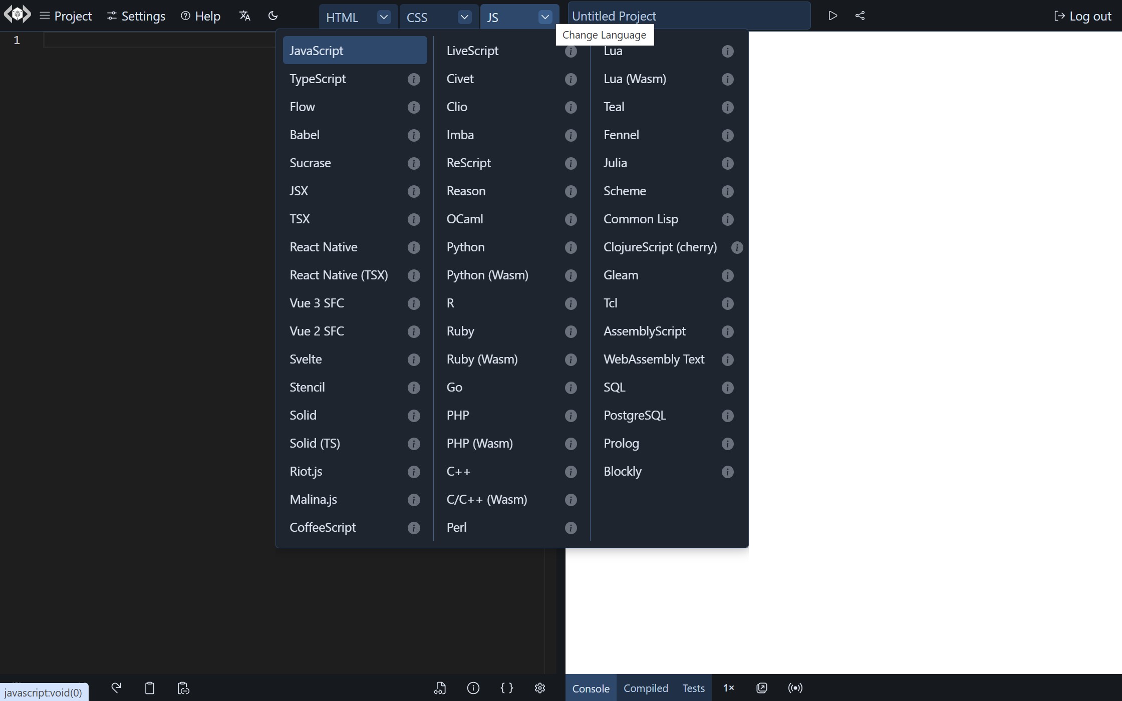
languages
Type: Language[] | undefined
Default: all supported languages in full app and only current editor languages in embeds.
List of enabled languages. Languages that are not already loaded in the editors (markup, style and script) can be selected from a drop down menu at the editor title.
markup
Type: Editor
Default: { language: "html", content: "" }
An object that configures the language and content of the markup editor. This can include the following properties:
-
language: Type: Language Default:"html"in markup editor,"css"in style editor and"javascript"in script editor. This can be a language name, extension or alias (as defined in language documentations). (e.g."markdown","md") -
content: Type:string | undefinedDefault:""The initial content of the code editor. -
contentUrl: Type:string | undefinedDefault:undefinedA URL to loadcontentfrom. It has to be a valid URL that is CORS-enabled. The URL is only fetched ifcontentproperty had no value. -
hiddenContent: Type:string | undefinedDefault:undefinedHidden content that gets evaluated without being visible in the code editor. This can be useful in embedded playgrounds (e.g. for adding helper functions, utilities or tests) -
hiddenContentUrl: Type:string | undefinedDefault:undefinedA URL to loadhiddenContentfrom. It has to be a valid URL that is CORS-enabled. The URL is only fetched ifhiddenContentproperty had no value. -
foldedLines: Type:Array<{ from: number; to: number }> | undefinedDefault:undefinedLines that get folded when the editor loads. The code can be unfolded by clicking on arrow beside the line. This can be useful for less relevant code in embedded playgrounds. -
title: Type:string | undefinedDefault:""If set, this is used as the title of the editor in the UI, overriding the default title set to the language name (e.g. "Python" can be used instead of "Py (Wasm)"). -
hideTitle: Type:boolean | undefinedDefault:""Iftrue, the title of the code editor is hidden, however its code is still evaluated. This can be useful in embedded playgrounds (e.g. for hiding unnecessary code). -
order: Type:number | undefinedDefault:0The order of the editor in the UI. -
selector: Type:string | undefinedDefault:undefinedA CSS selector to loadcontentfrom DOM import. -
position: Type:{lineNumber: number, column?: number} | undefinedDefault:undefinedThe initial position of the cursor in the code editor. Example:{lineNumber: 5, column: 10}
style
Type: Editor
Default: { language: "css", content: "" }
An object that configures the language and content of the style editor. See markup for more details.
script
Type: Editor
Default: { language: "javascript", content: "" }
An object that configures the language and content of the script editor. See markup for more details.
stylesheets
Type: string[]
Default: []
List of URLs for external stylesheets to add to the result page.
scripts
Type: string[]
Default: []
List of URLs for external scripts to add to the result page.
cssPreset
Type: "" | "normalize.css" | "reset-css"
Default: ""
CSS Preset to use.
processors
Type: Processor[]
Default: []
List of enabled CSS processors.
customSettings
Type: CustomSettings
Default: {}
Defines custom settings for the current project.
imports
Type: [key: string]: string
Default: {}
Allows specifying custom import maps for module imports.
For example, adding this JavaScript code:
import moment from 'moment';
import { partition } from 'lodash';
would add this import map in the result page:
<script type="importmap">
  {
    "imports": {
      "moment": "https://esm.sh/moment",
      "lodash": "https://esm.sh/lodash"
    }
  }
</script>
However, if imports is specified as follows:
{
  "imports": {
    "moment": "https://cdn.jsdelivr.net/npm/[email protected]/dist/moment.js"
  }
}
The import map becomes like this:
<script type="importmap">
  {
    "imports": {
      "moment": "https://cdn.jsdelivr.net/npm/[email protected]/dist/moment.js",
      "lodash": "https://esm.sh/lodash"
    }
  }
</script>
Currently, multiple import maps are not yet supported. https://crbug.com/927119
When bare module imports are encountered, LiveCodes adds an import map to the result page. If you need to add custom import map or override the automatically generated one, you need to add them to imports config property or imports customSettings property.
types
Type: [key: string]: string | { autoload?: boolean ; declareAsModule?: boolean ; url: string }
Default: {}
Allows providing custom TypeScript type declarations for better editor intellisense.
It is an object where each key represents module name and value represents the types. This can be a URL to a type declaration file. For example, if this is the type declaration file:
declare module 'my-demo-lib' {
  export class Greeter {
    morning(): string;
    evening(): string;
  }
}
It can be used like that:
{
  "types": {
    "my-demo-lib": "https://my-custom-domain/my-type-declarations.d.ts"
  }
}
Alternatively, the value for module name can be an object with the following properties:
url:string(required). The URL to type declaration file.autoload:boolean(optional). By default, the types are only loaded when the module is imported in code. Ifautoloadproperty is set totrue, the types are loaded regardless if the module was imported.declareAsModule:boolean(optional). Declares the types as module with the supplied module name.
Example:
{
  "types": {
    "my-demo-lib": {
      "url": "https://my-custom-domain/types.d.ts",
      "autoload": true,
      "declareAsModule": true
    }
  }
}
tests
Type: undefined | Partial<Editor>
Default: { language: 'typescript', content: '' }
Configures the language and content of tests.
version
Type: Readonly string
Default: Current LiveCodes Version.
This is a read-only property which specifies the current LiveCodes version. It can be shown using the SDK exec method.
// in browser console of full app (e.g. https://livecodes.io)
await livecodes.exec('showVersion');
Version specified in exported projects allows automatically upgrading the project configuration when imported by an app with a newer version.
App Settings
These are properties that define how the app behaves.
readonly
Type: boolean
Default: false
If true, editors are loaded in read-only mode, where the user is not allowed to change the code.
By default, when readonly is set to true, the light-weight code editor CodeJar is used. If you wish to use another editor, set the editor property.
allowLangChange
Type: boolean
Default: true
If false, the UI will not show the menu that allows changing editor language.
view
Type: "split" | "editor" | "result"
Default: "split"
The default view for the playground.
mode
Type: "full" | "focus" | "simple" | "lite" | "result" | "editor" | "codeblock"
Default: "full"
Sets the display mode.
tools
Default: { enabled: 'all', active: '', status: '' }
Sets enabled and active tools and status of tools pane.
Example:
{
  "tools": {
    "enabled": ["console", "compiled"],
    "active": "console",
    "status": "open"
  }
}
zoom
Type: 1 | 0.5 | 0.25
Default: 1
Sets result page zoom level.
User Settings
These are properties that define the user settings, including editor settings.
autoupdate
Type: boolean
Default: true
If true, the result page is automatically updated on code change, after time delay.
autosave
Type: boolean
Default: false
If true, the project is automatically saved on code change, after time delay.
autotest
Type: boolean
Default: false
If true, the project is watched for code changes which trigger tests to auto-run.
delay
Type: number
Default: 1500
Time delay (in milliseconds) following code change, after which the result page is updated (if autoupdate is true) and/or the project is saved (if autosave is true).
formatOnsave
Type: boolean
Default: false
If true, the code is automatically formatted on saving the project.
layout
Type: "horizontal"| "vertical" | "responsive" | undefined
Default: "responsive"
Sets the app layout to horizontal or vertical. If set to "responsive" (the default) or undefined, the layout is vertical in small screens when the playground height is larger than its width, otherwise horizontal.
theme
Type: "light" | "dark"
Default: "dark"
Sets the app theme to light/dark mode.
themeColor
Type: string | undefined
Default: "hsl(214, 40%, 50%)"
A string representing a CSS color value, used to set the app theme color. It can be any valid CSS color value, such as "#4DB39E", "rgb(245, 225, 49)", "hsl(324, 40%, 50%)" and "lightblue".
editorTheme
Type: EditorTheme[] | string | undefined
Default: undefined
Sets the code editor themes.
You can preview and set editor themes in the editor settings screen.
Three code editors are supported in LiveCodes: Monaco (the default on desktop), CodeMirror (the default on mobile) and CodeJar (the default in codeblocks, in lite mode and in readonly playgrounds). Each editor has its own set of themes, represented by the types: MonacoTheme, CodemirrorTheme and CodejarTheme.
The editorTheme property can be used to set the editor theme for each editor and on light/dark modes. It can be set to an array of EditorTheme items or a string of comma-separated items.
Each item can be composed of:
editor: theme-name @app-theme
Where:
editoris the name of the editor ("monaco" | "codemirror" | "codejar"). [Optional]theme-nameis the name of the theme (e.g."monokai"). [Required] Valid theme names can be found here:- Monaco:
MonacoTheme - CodeMirror:
CodemirrorTheme - CodeJar:
CodejarTheme.
- Monaco:
app-themeis the name of the app theme ("dark" | "light"). [Optional]
Examples:
"vs""monaco:twilight, codemirror:one-dark"["vs@light"]["vs@light", "vs-dark@dark"]["monaco:vs@light", "codemirror:github-light@light", "dracula@dark"]
Each EditorTheme item requires a theme name. The theme name can optionally be preceded with the editor name separated by a colon to specify the editor (e.g. "monaco:monokai"). It can also optionally be followed by the app theme separated by "@" (e.g. "monokai@dark").
Multiple EditorTheme items can be supplied (as array items or in the comma-separated string) to specify the theme for each editor and in dark and light modes. The order matters. The first valid item in the array or string for the current editor (monaco, codemirror or codejar) and app theme (light or dark) will be used. If no items match the current editor and app theme, the default theme for the editor and app theme will be used.
appLanguage
Type: AppLanguage | undefined
Default: undefined
Spoken language code that sets the app UI language (e.g. "ar", "zh-CN"). Used in translations for internationalization. If undefined (the default), the language is automatically detected based on the user's browser settings and falls back to English, if detection fails or the language is not supported.
recoverUnsaved
Type: boolean
Default: true
Enables recovering last unsaved project when the app is reopened.
welcome
Type: boolean
Default: true
If true, the welcome screen is displayed when the app loads.
showSpacing
Type: boolean
Default: false
Enables showing element spacing in the result page.
editor
Type: "monaco" | "codemirror" | "codejar" | "auto" | undefined
Default: undefined
Selects the code editor to use.
If undefined (the default):
Monaco editor is used on desktop,
CodeMirror is used on mobile and in simple mode,
while CodeJar is used in codeblock mode, in lite mode and in readonly playgrounds.
If set to auto, Monaco editor is used on desktop and CodeMirror is used on mobile regardless of other settings.
fontFamily
Type: string | undefined
Default: undefined
Sets the code editor font family.
fontSize
Type: number | undefined
Default: undefined
Sets the code editor font size.
If undefined (the default), the font size is set to 14 for the full app and 12 for embeds.
useTabs
Type: boolean
Default: false
If true, lines are indented with tabs instead of spaces. Also used in code formatting.
tabSize
Type: number
Default: 2
The number of spaces per indentation-level. Also used in code formatting.
lineNumbers
Type: boolean | "relative"
Default: true
Show line numbers in code editor.
If set to "relative", line numbers are shown relative to the current line. This can be useful with vim mode.
wordWrap
Type: boolean
Default: false
Enables word-wrap for long lines.
closeBrackets
Type: boolean
Default: true
Use auto-complete to close brackets and quotes.
foldRegions
Type: boolean
Default: false
When set to true, regions marked by #region and #endregion comments are folded when the project is loaded.
minimap
Type: boolean
Default: false
Enables minimap in code editor.
emmet
Type: boolean
Default: true
Enables Emmet.
editorMode
Type: "vim" | "emacs" | undefined
Default: undefined
Sets editor mode.
semicolons
Type: boolean
Default: true
Configures Prettier code formatter to use semi-colons.
singleQuote
Type: boolean
Default: false
Configures Prettier code formatter to use single quotes instead of double quotes.
trailingComma
Type: boolean
Default: true
Configures Prettier code formatter to use trailing commas.